

Why White is Important and How to Use it Effectively in Art&Design?
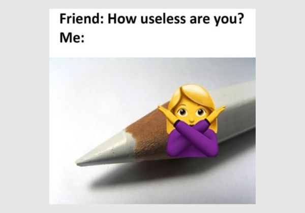

You’ve probably seen this meme that apparently mocks the white colored pencil… It makes me wonder what it ever did to this meme’s author that he or she thought of it as something useless. I find this meme so repulsive that I was driven to write about it.
This seemingly “useless” colored pencil in the bunch has a valuable role in an art piece on its own merits. Use it to highlight or adjust color’s luminosity. That way, you can direct your audience to where to focus their eyes on. And so, you are making your audience “breathe”. With it, the objects in your art can stand out the way you want them.
If you were to ask an artist to name at least two of the most essential colors in any art piece, you might probably hear BLACK and WHITE in various intensities.
Let’s take a look at white’s deeper meaning.
The meaning of the color white
White, in color personality, depicts purity. Individuals who love whites are often depicted as someone who is meticulous and perfectionist. Conversely, a person who does not like white often gives the impression of being carefree and messy. Yes, that’s just about the stereotype and not an absolute basis of the personality of an individual. But let’s admit it. It does make sense. White is something hard to keep. A simple smudge and everyone’s eyes are fixated on the flaw. And most of the time, it takes is a good cleaning to make it all fair and immaculate again. For this, white is also a symbol of a new beginning – a clean slate.
In designs, white is a favorite because it gives a sense of simplicity, of high-quality standard, sophistication, efficiency, purity, timelessness, trust, and reliability. No wonder that the Apple brand uses white as one of the most fundamental colors for their gadgets.
Whitespace – When less is more
Let me introduce a related concept — whitespace. What is whitespace? To a designer, whitespace is basically the “negative space” or that space not occupied by anything. It is the empty space in a design that is left unmarked and unused. It is often white but it can also be another plain color, so, whitespace isn’t necessarily white for that matter.
Let’s take a look at the homepage of Google. It is one of the most popular pages to have used whitespace effectively. Google’s homepage is simple. It perfectly embodies the saying that “less is more”. It depicts the importance and meaning of whitespace in the design. Since there are no other unnecessary and irrelevant objects on the page, your mind can easily focus and carry out the single, most important purpose of your visit — which is to do a search.
Why is whitespace important?
Why is whitespace important in graphic art and design? Firstly, it tidies up your art or your design. The spaces between the objects in your canvas make them occupy a site and thereby perform a specific function that serves the overall goal. In biology, we call that an “ecological niche”.
With the right amount of whitespace, the objects are organized and decluttered. Your audience can better understand what you want to impart. And when they understand what they see, it leads to a better user experience.
How to use whitespace in a good way?
Balancing whitespace and used space is crucial to a design. Use too much whitespace and your design will likely leave off some of the most essential information. Leave a little whitespace and your design looks heavy, hard to read, disorganized, and cluttered. Both extremes will likely make your design ineffective. Thus, how can you achieve the right formula?
The whitespace design principle
Whitespace becomes a wasted space if it is no longer serving its purpose.
As I mentioned above, the whitespace should make your design elements or objects to be more organized and legible. These objects need to be able to carry out their respective roles yet they have to be interconnected. If the whitespace does not serve this purpose then you are probably wasting space.
So what is too much whitespace? What is the right formula?
Let me borrow the line from the movie, KungFu Panda.
There is no secret ingredient.
The rule of thumb is to ask yourself the question, is it serving its purpose?
Does it help steer the audience’s focus and attention to where you want them to?
Does it convert?
Once you know the answers, then you get a hint.
Comparison of two great artworks: one with white and one without
See the photos below. On the left is an artwork that includes a white element. On the right is an artwork without a tinge of white. They are both great artworks. However, can you perceive or feel the difference?
Excellent examples of white in artwork and as whitespace:


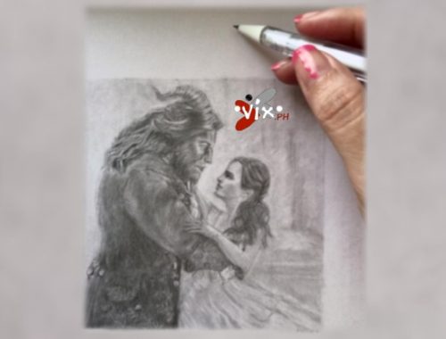
Sample Black & White Drawing by VixMaria
In this drawing, although the white parts have already been tinged with the dark graphite pencil I used, it still shows the contrast I made by employing varying intensities.


